Understanding Statistics Intuitively (What "Average" Hides)
Statistics is the math of making sense of data, of pulling a reliable signal out of a pile of numbers that vary. It does two jobs: it summarizes what you already have (a class of test scores, a month of sales) and it lets you reason about what you cannot see in full (the opinions of an entire country from a poll of a thousand people). This article builds both ideas from scratch, then shows where the familiar terms (mean, median, standard deviation, the bell curve) actually come from.
Statistics has a reputation problem. Many students meet it as a bag of formulas to memorize: this one for variance, that one for the standard error, a third for the correlation coefficient. The formulas get applied, the answers get computed, and the meaning never arrives.
Let us fix that.
Two Jobs, Not One
Everything in an intro statistics course falls into one of two buckets.
Descriptive statistics summarizes data you have. If you measured the height of every student in a school, descriptive statistics boils those hundreds of numbers down to a few that capture the essence: a typical height, how much heights vary, what the shape of the distribution looks like.
Inferential statistics reasons about data you do not have. You cannot measure the height of every adult on Earth, so you measure a sample and infer something about everyone. This is where polls, medical trials, and quality control live. It is the more powerful half, and it rests entirely on the descriptive half.
Almost every confusion in statistics clears up once you ask: am I describing what I have, or inferring about what I do not? Start with describing.
The Center: Where the Data Sits
The first question about any dataset is "what is a typical value?" There are three honest answers, and they disagree on purpose.
The mean is what most people call the average: add everything up, divide by the count. It uses every value, which is its strength and its weakness.
The median is the middle value once you sort the data. Half the values sit above it, half below. It ignores how extreme the extremes are and only cares about position.
The mode is the value that shows up most often. It is the only one that works for things you cannot average, like the most common shoe size sold.
For symmetric data, all three land in roughly the same place, and the distinction feels academic. The distinction stops being academic the moment the data is skewed.
Picture a room with nine schoolteachers and one billionaire. The median income describes a normal teacher, because the middle person is a teacher. The mean income is in the tens of millions, because the billionaire drags it up. Both numbers are correct. Only one is honest about a typical person in the room.
This is the single most important habit in reading statistics: when someone reports an "average," ask whether it is a mean or a median, and ask whether the data is skewed. Incomes, home prices, wait times, and view counts are almost always skewed, and the mean almost always flatters them.
The Spread: Why the Center Is Not Enough
Two datasets can share the exact same mean and be nothing alike.
Class A scores: 70, 72, 70, 68, 70. Mean: 70. Class B scores: 40, 95, 100, 50, 65. Mean: 70.
Same average, completely different stories. Class A is consistent. Class B is chaotic. The mean alone cannot tell them apart, so we need a number for spread.
The crude version is the range, the largest value minus the smallest. It is easy but fragile, because it depends on only two numbers and one outlier wrecks it.
The serious version is the standard deviation, and the idea behind it is simpler than the formula suggests. Ask: on average, how far is each value from the mean? Measure each value's distance from the mean, then take a kind of average of those distances. A small standard deviation means everything huddles near the center (Class A). A large one means values are flung far and wide (Class B).
The reason the formula squares the distances and then takes a square root at the end (rather than just averaging the raw distances) is mostly so that positive and negative gaps do not cancel out, and so that larger deviations count for more. But the meaning never changes: standard deviation is the typical distance from the average, reported in the same units as the data. If test scores have a standard deviation of 8 points, then "give or take 8 points" is your sense of how much scores wander.
The mean tells you where. The standard deviation tells you how much you can trust "where" to describe any single case.
The Shape: The Bell Curve and Why It Is Everywhere
Once you have center and spread, the natural next question is the overall shape of the data. Plot how often each value occurs and you get a distribution.
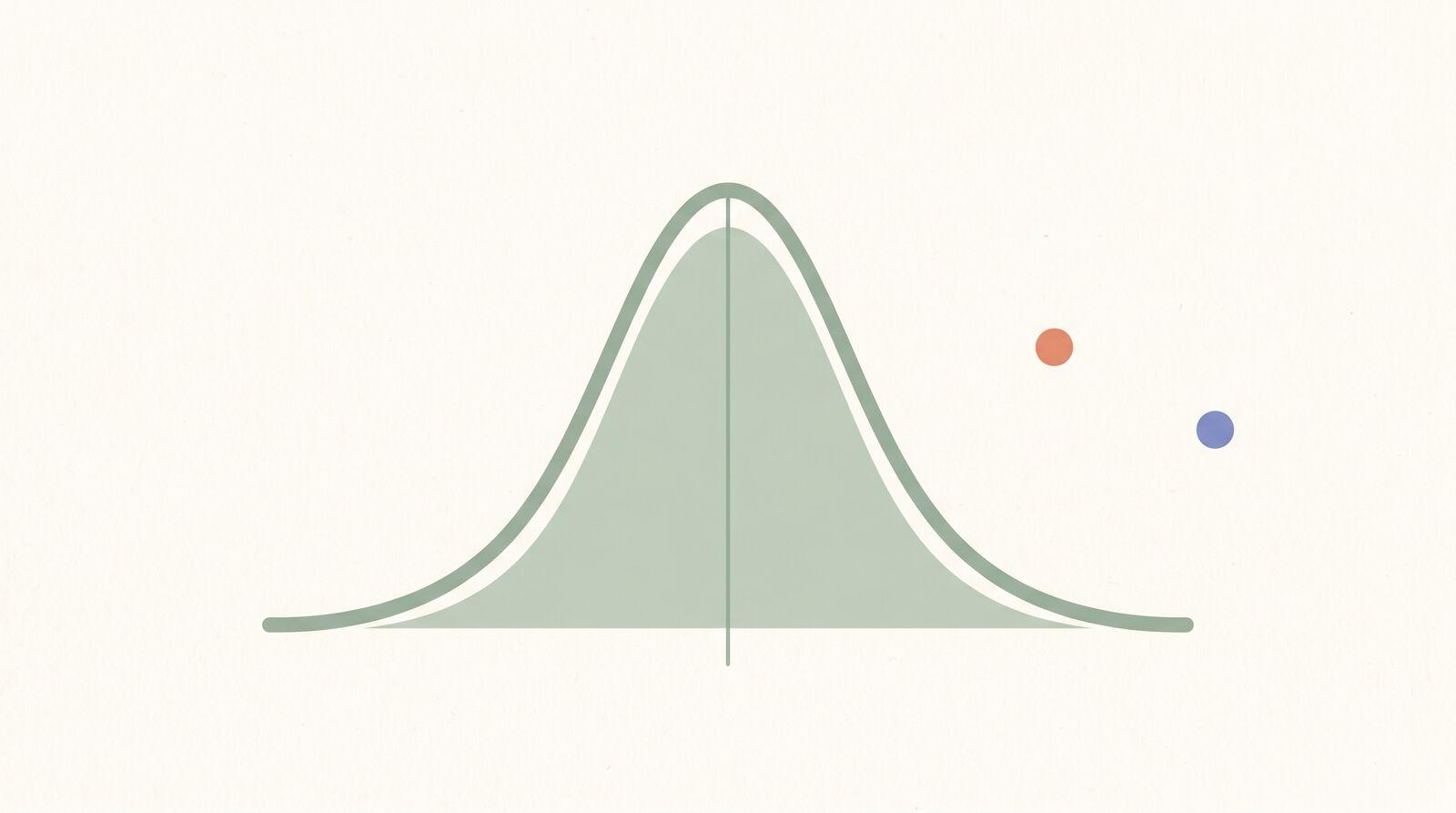
The most famous shape is the normal distribution, the bell curve: symmetric, with most values bunched near the mean and fewer and fewer as you move out toward the extremes. Heights, measurement errors, and many natural quantities follow it closely.
The bell curve shows up so often for a deep reason. When a quantity is the sum of many small independent influences (your height is genes plus nutrition plus sleep plus a hundred other nudges), the result tends toward a bell curve, almost regardless of how each individual influence behaves. That is the rough idea behind one of the most important results in all of statistics, the central limit theorem, and it is why the normal distribution is the default backdrop for so much of inference.
The bell curve also gives standard deviation a concrete payoff. For normal data, about 68 percent of values fall within one standard deviation of the mean, about 95 percent within two, and about 99.7 percent within three. So if adult heights have a mean of 170 cm and a standard deviation of 7 cm, then roughly 95 percent of people fall between 156 and 184 cm. The spread number stops being abstract and starts predicting where things actually land.
Correlation Is Not Causation
When two quantities move together, we say they are correlated. Taller people tend to weigh more: height and weight are positively correlated. As one goes up, so does the other.
The trap is treating correlation as proof of cause. Ice cream sales and drowning deaths rise together every summer. Ice cream does not cause drowning. A hidden third factor, hot weather, drives both. This is a confounding variable, and it is the reason correlation alone never establishes causation.
Correlation is a genuine clue. It tells you where to look. But to claim that A causes B, you need more: a controlled experiment, a plausible mechanism, and the elimination of confounders. The headlines that announce "people who do X live longer" almost always rest on correlation, and almost always overreach. Reading that skeptically is one of the most useful things statistics teaches.
Inference: How a Few Speak for the Many
Now the powerful half. A national poll of 1,000 people claims to represent 300 million. How is that not absurd?
The key insight is that randomness is predictable in bulk. If your sample is genuinely random and representative, the math of probability tells you how far off your estimate is likely to be. That uncertainty gets reported as a margin of error: "52 percent, plus or minus 3 points" means the true figure is very likely between 49 and 55 percent.
Two things determine whether you can trust an inference:
- Sample size controls random noise. Bigger samples give narrower margins of error, though with diminishing returns, halving the error takes roughly four times the sample.
- Sample quality controls bias, and bias is the deadlier problem. A poll of a million people who all visit the same website tells you about that website, not the country. No sample size fixes a sample that systematically excludes people. Representativeness comes first; size only sharpens an already fair sample.
This is why the question to ask about any statistic is not just "how big was the study" but "who was actually in it, and who got left out."
Common Traps to Watch For
Statistics is honest. The way it gets reported often is not. A few patterns to catch:
- The averaged-away average. "Average customer satisfaction is high" can hide a split crowd of very happy and very angry customers, with almost nobody in the middle. Always ask about spread, not just center.
- The truncated axis. A bar chart whose vertical axis starts at 90 instead of 0 turns a tiny difference into a dramatic cliff. The numbers are real; the picture lies.
- The missing denominator. "Cases doubled" is meaningless without knowing whether that is two to four or two million to four million. A percentage change is only as meaningful as the base it is measured against.
- Cherry-picked endpoints. Pick the right start and end dates and almost any trend can be made to point up or down.
How This Connects to the Rest of Math
Statistics does not stand alone. It sits on top of ideas you may have already met. It is built from probability, which supplies the rules for how random samples behave and where margins of error come from. It leans on percentages and proportions for nearly every result it reports. And the smooth curves it relies on, the area-under-the-bell-curve calculations that turn a distribution into a probability, are the same integration ideas from calculus, applied to data.
When you practice statistics in Math Zen, the problems progress from descriptive measures (computing and comparing means, medians, and standard deviations) into reading distributions and reasoning about samples. Working them by hand, rather than letting a calculator spit out a number, is what builds the instinct to ask the right question: is this center honest, is this spread small enough to trust, is this correlation actually telling me anything? Mixing those problem types over time, using the spaced repetition built into the practice flow, is what makes the intuition stick rather than fade after the test.
The Takeaway
Statistics is two jobs: describing the data you have and inferring about the data you do not. Describing needs three numbers, a center (mean or median, and the choice matters when data is skewed), a spread (standard deviation, the typical distance from the center), and a shape (often the bell curve). Inferring needs a sample that is representative first and large second, and an honest margin of error.
Next time you see a statistic, do not just read the number. Ask: mean or median? How much spread? Who was in the sample? Correlation or cause? Those four questions turn statistics from a wall of formulas into a tool for not being fooled.
Common Questions
- What is the difference between mean, median, and mode?
- The mean is the arithmetic average, the sum of all values divided by how many there are. The median is the middle value when the data is sorted, with half above and half below. The mode is the value that appears most often. They agree for symmetric data but pull apart when the data is skewed, which is exactly when the choice matters.
- When should I use the median instead of the mean?
- Use the median whenever a few extreme values would drag the mean somewhere unrepresentative. Incomes, house prices, and response times are classic cases. One billionaire in a room of teachers makes the mean income misleading, but the median still describes a typical person in the room.
- What does standard deviation actually measure?
- Standard deviation measures how spread out the data is around the mean, in the same units as the data itself. A small standard deviation means values cluster tightly near the average. A large one means they scatter widely. It answers the question the mean cannot, how typical is typical.
- What is the difference between correlation and causation?
- Correlation means two things tend to move together. Causation means one actually makes the other happen. Ice cream sales and drowning rise together, but neither causes the other, summer heat drives both. Correlation is a clue worth investigating, never proof on its own.
- Why is a larger sample size better?
- Larger samples shrink random noise, so the result is more likely to reflect the true population. The catch: size cannot fix a biased sample. A poll of a million people who all read the same website is still skewed. Representativeness matters more than raw size, and only after that does size sharpen the estimate.